I had a comment on yesterday's post (from the far from unobservant Z), because I described our house as modern, when it was built in the 1930's. This is worth exploring a little further.
The first house I lived in, Summer Hill, was built for my father on a plot of land he owned, in the 1950's. The second house, the curiously named Cobber's Hill probably dated fromthe mid sixties. So here I am, at thirteen, moving into a house that is older than either of the other homes i've lived in, and yet I call it 'modern'. What's that all about?
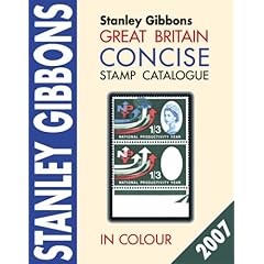
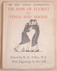
I used to collect stamps, and for some reason, I was particularly fascinated by a range of stamp called the King Edward VIII Definitives. Perhaps it was because they were rare and collectable - the King was only on the throne for eleven months - but I was also fascinated by the elegance of their design. They were designed by a man called Eric Gill. I also had a set of books called the New Temple Shakespeare, which was a pocket edition, with a separate book for each of the plays, the same size as Beatrix Potter's Peter books. Every book had an engraving by Eric Gill on the dust jacket, and more engravings inside, to illustrate the plays.
At some point, I matched the name of Eric Gill in Stanley Stamp's Gibbon Catalogue to the name on my Shakespeare books, and was interested enough to look him up in an encyclopedia one day in the local reference library. That, gentle reader, is how I became fascinated by the art and design of the 1930's, and also began to get a wee bit pretentious, and use the word 'modern' in a different context, besides just meaning the most up-to-date.

I was too young to be interested Shakespeare at that age. My parents had just decided to leave a set of his plays in my bedroom, like Desert Island Discs, in the hope that somehow I would find them, and start to become cultured and intelligent.
They did this with another book, too. A sex education manual. That one, I did read, and not just study the pictures. Since it was a book for parents, not children, it wasn't entirely informative. But I did learn that parents can be very confused and embarrassed about sex, and I resolved not to trouble mine any further.
I remember soaking stamps off envelopes in the washbasin in the downstairs bathroom in the house in Sandygate Lane. It was an avocado bathroom, which had apparently very fashionable at some point. My parents had gone out for the evening, and I cleaned up the basin and put the stamps somewhere to dry out, and I sat down to watch - heaven only knows how I come to remember this - The Thomas Crown Affair, which was being repeated on television that night.
It was the Steve McQueen original, not the Pierce Brosnan remake. I remember being quite interested in Faye Dunaway, and fascinated by the split screen photography, but mostly, it was the song about the windmills that stayed with me.
(I know I'm still avoiding writing about Wimbledon, and my raging fever, and the pond at the bottom of the garden. Bear with me, I'll get around to it.)
The first house I lived in, Summer Hill, was built for my father on a plot of land he owned, in the 1950's. The second house, the curiously named Cobber's Hill probably dated fromthe mid sixties. So here I am, at thirteen, moving into a house that is older than either of the other homes i've lived in, and yet I call it 'modern'. What's that all about?
I used to collect stamps, and for some reason, I was particularly fascinated by a range of stamp called the King Edward VIII Definitives. Perhaps it was because they were rare and collectable - the King was only on the throne for eleven months - but I was also fascinated by the elegance of their design. They were designed by a man called Eric Gill. I also had a set of books called the New Temple Shakespeare, which was a pocket edition, with a separate book for each of the plays, the same size as Beatrix Potter's Peter books. Every book had an engraving by Eric Gill on the dust jacket, and more engravings inside, to illustrate the plays.
At some point, I matched the name of Eric Gill in Stanley Stamp's Gibbon Catalogue to the name on my Shakespeare books, and was interested enough to look him up in an encyclopedia one day in the local reference library. That, gentle reader, is how I became fascinated by the art and design of the 1930's, and also began to get a wee bit pretentious, and use the word 'modern' in a different context, besides just meaning the most up-to-date.

I was too young to be interested Shakespeare at that age. My parents had just decided to leave a set of his plays in my bedroom, like Desert Island Discs, in the hope that somehow I would find them, and start to become cultured and intelligent.
They did this with another book, too. A sex education manual. That one, I did read, and not just study the pictures. Since it was a book for parents, not children, it wasn't entirely informative. But I did learn that parents can be very confused and embarrassed about sex, and I resolved not to trouble mine any further.
I remember soaking stamps off envelopes in the washbasin in the downstairs bathroom in the house in Sandygate Lane. It was an avocado bathroom, which had apparently very fashionable at some point. My parents had gone out for the evening, and I cleaned up the basin and put the stamps somewhere to dry out, and I sat down to watch - heaven only knows how I come to remember this - The Thomas Crown Affair, which was being repeated on television that night.
It was the Steve McQueen original, not the Pierce Brosnan remake. I remember being quite interested in Faye Dunaway, and fascinated by the split screen photography, but mostly, it was the song about the windmills that stayed with me.
(I know I'm still avoiding writing about Wimbledon, and my raging fever, and the pond at the bottom of the garden. Bear with me, I'll get around to it.)


3 comments:
please please please tell me that your Eric Gill was the same Eric Gill who designed my favourite typeface. . .
"Gill Sans was first introduced in 1928. Eric Gill studied under the renowned calligrapher, Edward Johnston, the designer of the London Underground sans serif typeface. This influenced Gill who later experimented with sans serif designs, and in due course produced a set of capital letters. A twentieth century sans serif that has a simplicity of form which does not reject traditional forms and proportions, and gives the face a humanist feel. The lighter weights are highly readable in text and suitable for magazine and book work, whereas the heavier weights are best used for display in advertising, packaging, and labels."
can't remember how to do the h ref linky thing, but check out the heavy boxes performing quick waltzes here:
http://www.ascendercorp.com/msfonts/gill_sans.html
(more interesting than quick brown dogs jumping over lazy foxes, I think)
I always like names that look good in a block
ERIC
GILL
which is why, when I was a fledgling bookbinder, my nom-de-press was Anna Ross (both derivatives of my actual name)(and was also satisfying, because of the repetition of letters)
ANNA
ROSS
I think your use of 'modern' in the context of 1930s architecture is entirely appropriate. After all, we're now beyond post-modernism (but don't ask me where we are!)/
I,LTV - yes, indeed it is the same man.
Post a Comment